BinWise is a SaaS system for restaurants to manage all aspects of their beverage program - inventory, purchasing, sales, wine lists - in one central place. The team did not have a designer prior to my joining the company, nor any design processes in place. After a few years of developing the product this way, they ended up with a site full of convoluted user flows, confusing and cluttered UI, and inconsistent interactions and visuals.
I instituted changes to move to a human-centered design process.
- Talk to our users through interviews and surveys, so that we can understand how our customers use the product and what they need it to do to make their lives easier.
- Develop a design system and implement it in the form of a pattern library.
Design Principles
During user research, I interviewed and observed our customers to understand current workflow problems.
Some key points we learned from this research include...
- No one gets in the wine and food business because they love administration or accounting! The product should enable our customers to get the mundane work out of the way quickly, so that they can get back to what they really love - being on the floor and interfacing with customers.
- Restaurant employees work 12-14 hour days regularly - this product should decrease their work time, but due to poor UX it sometimes increases it.
These findings helped me establish design principles for future development:
- Clarity
- Help the user manage their information, guide the user through activities, and provide instructions when needed.
- Consistency
- Establish and reuse visual and interaction patterns to unite the experience and decrease pattern learning, confusion, and frustration among our users, creating a trustworthy product.
- Efficiency
- Enable our customers to get administrative work out of the way quickly; activities should take as little amount of time as possible. For example, do not block non-destructive tasks with confirmation pop-ups disrupts focus and adds time. Instead, provide undo.
- Be Accessible
- Update existing styles to make all text readable by increasing the size and contrast, and use color to support information instead of as the only means of conveying it.
- Be Forgiving
- Everybody makes mistakes - enable users to fix theirs.
Personas
I distilled the user research into 3 personas that reflect the roles encountered in the research. We used these as a starting point for new projects to design for a primary role and to contextualize the work environments. (These were iterated on from an original 6, which proved confusing because each one did not have enough distinction.)


Visual design update
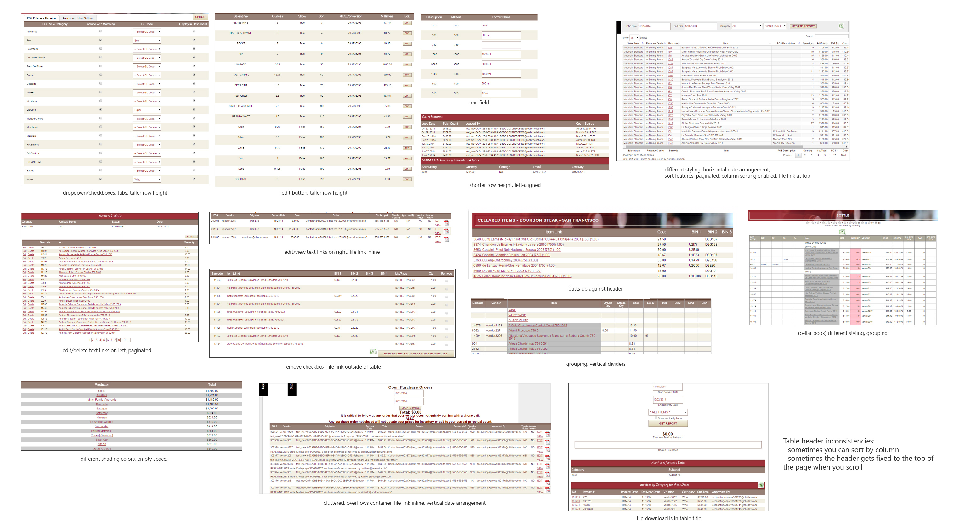
The visual design of the current product negatively impacted the usability. This example demonstrates 14 different tables in the app. Each table looks and behaves differently from the others.
As we found in the interviews, our customers don't really care about aesthetics or how shiny a gradient is. What matters is that the product works and enables users do what they need to do.
To that end, the redesigned visuals must...
- Present information clearly and in an organized way
- Create a visual hierarchy to help guide the user through the screens and their tasks
- Should unite the product to make a consistent system that looks and functions as one experience
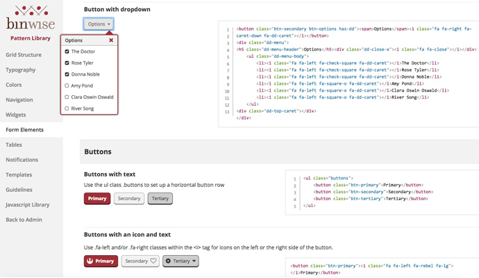
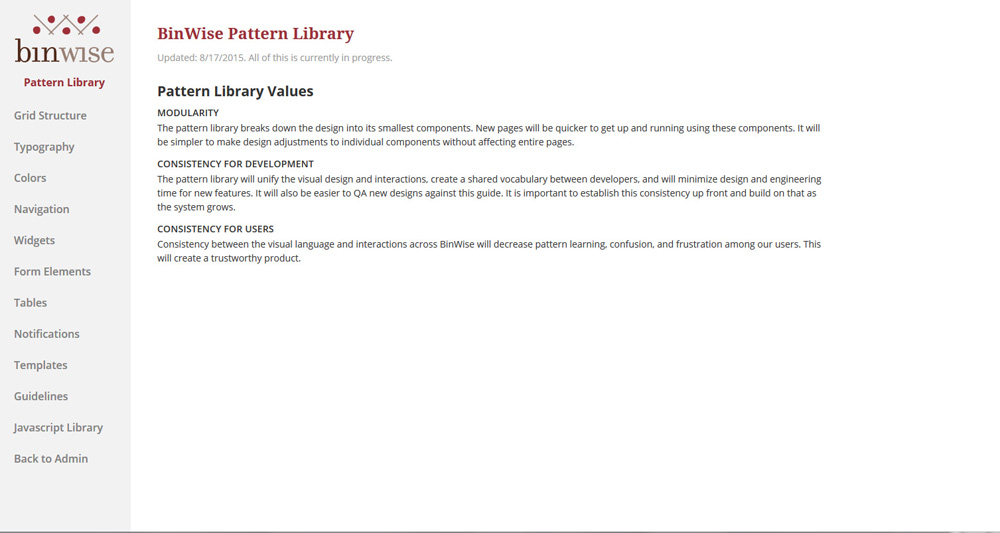
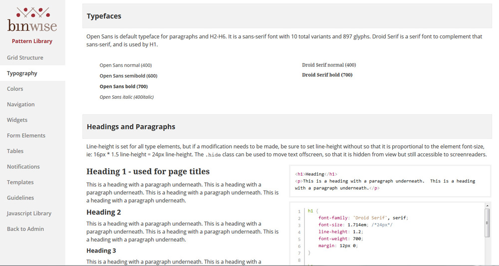
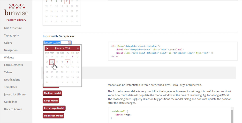
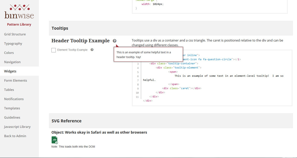
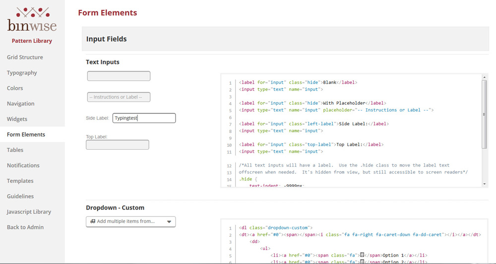
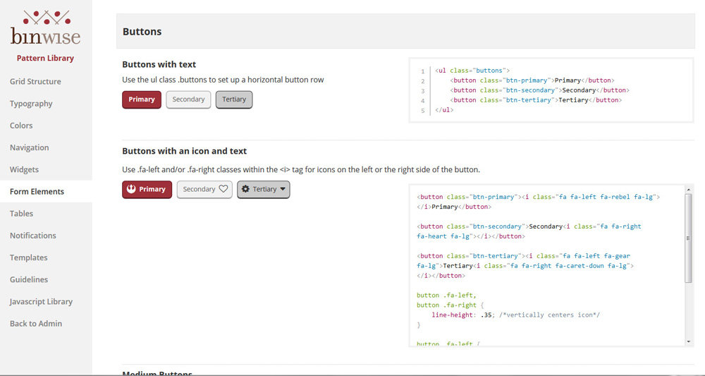
The styles live in a live pattern library as a place for the UI patterns to live and the code to be documented. The pattern library also creates a shared vocabulary among the team, and reduces tech and design time. These were implemented into the system for all net new features; existing features were updated as time permitted.
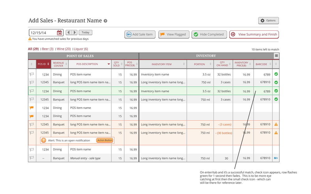
In testing new features that use the new styles, we received comments the new design is "very clear" and "easy to understand".
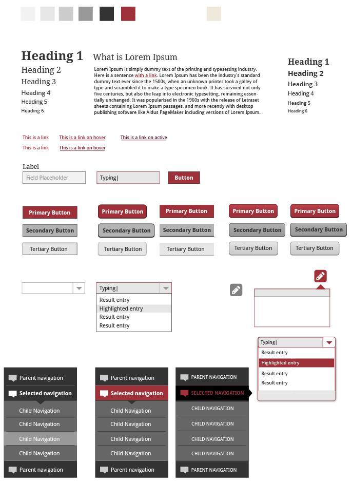
Visual design exploration

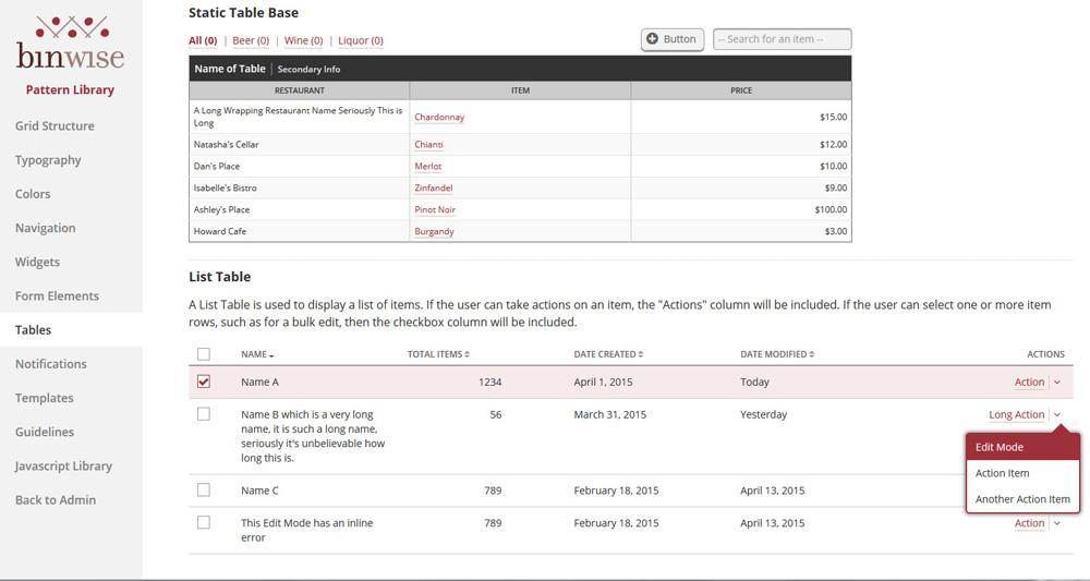
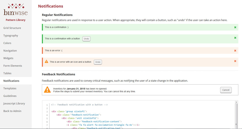
Pattern Library Screenshots
The front end developer and I translated the design comps into live code, and made refinements from there
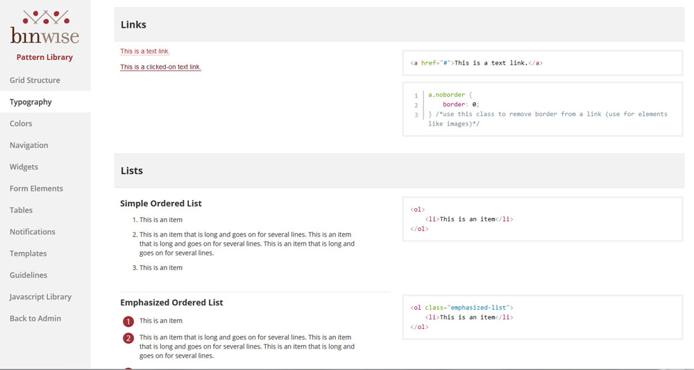

Alerts were coded as orange instead of the conventional red, because the BinWise identity already used red as its key color.
No comments.