To support Pantheon's updated pricing and packaging for the first time in company history, our goals were:
- Proactively communicate the value of the platform and minimize the perception of commodity web hosting
- Update the checkout experience to fall more in line with expected e-commerce patterns
Existing Problems

Old design: Before the update the potential customer was blocked from even being able to see the offers available by this modal asking them to first add a credit card.

Old design: Once a credit card was added, the presentation of the offers was minimal and didn't help the user understand which option was the best choice for their site.

Old design: Even worse, potential customers had trouble locating the area to choose a plan. In one user test, all 5 testers had difficulty locating where to buy a plan (it's under "Settings").
New designs
We did extensive user testing to ensure we sell the benefits the customer will receive (not features), highlight our main value prop, and call out differentiators we learned users care most about.

New design: During our research, we learned which benefits tested as highly desirable compared to others. For this product area where a customer buys a site plan, we highlighted benefits over features.
We highlighted the Performance plan as our main value prop. As such, it comes in 4 sizes to support nearly every site. Size refers to the amount of traffic and storage a site needs. The risk here is because so many services offer pageviews for cheap, we had to find a way to minimize pre-existing notions of commodity hosting. Pantheon does host the site, but also offers benefits and tools that other services do not, so that development productivity increases and the site performs better for users.
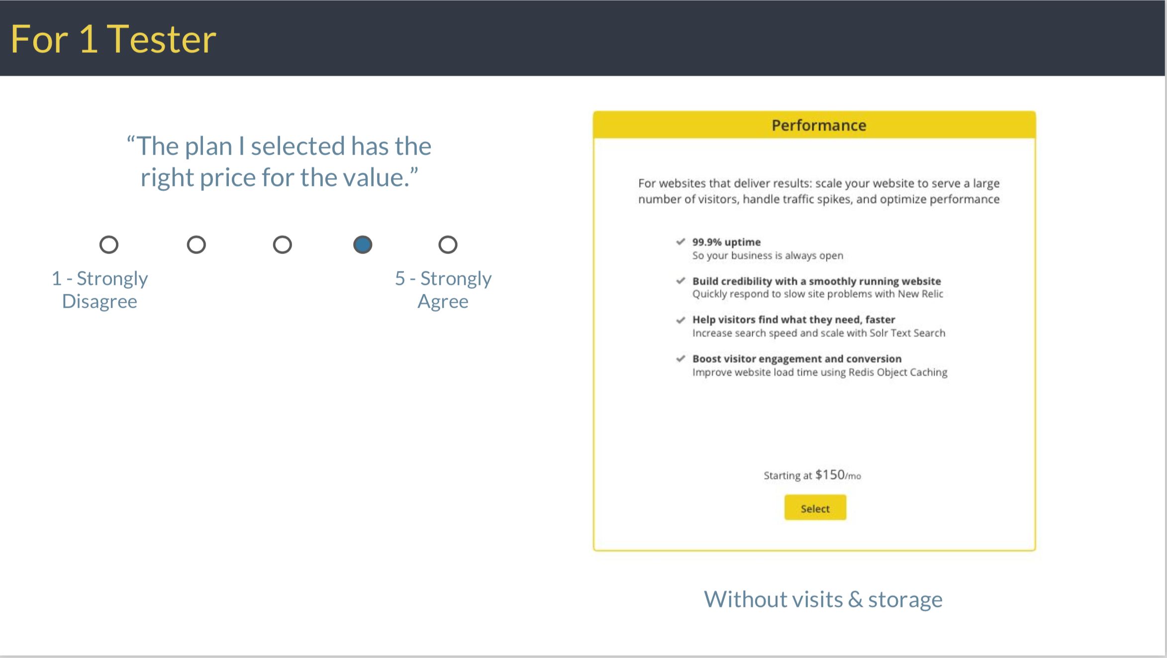
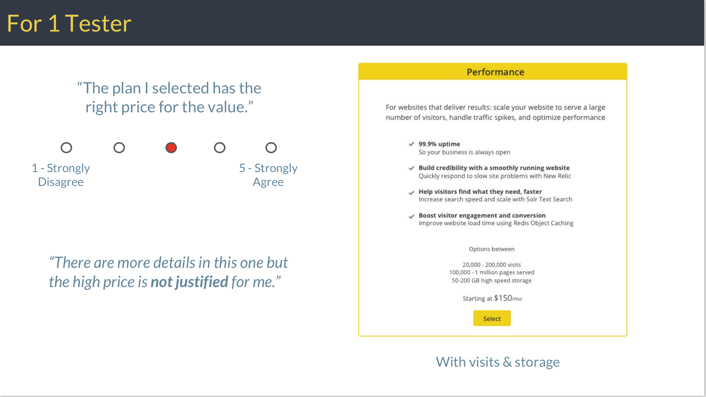
For the same tester who chose the same plan, the version displaying pageviews and storage lowered the value.
After this and several more rounds of testing, we found that focusing solely on the plan benefits on the top level page and leaving exact size details for later increased the value testers reported receiving. When selecting the plan size as a next step, it is positioned more as an afterthought, and therefore perception of buying a commodity was greatly reduced.
See a user test analysis presentation for more detail about design variations I tested, including testing against competitors.

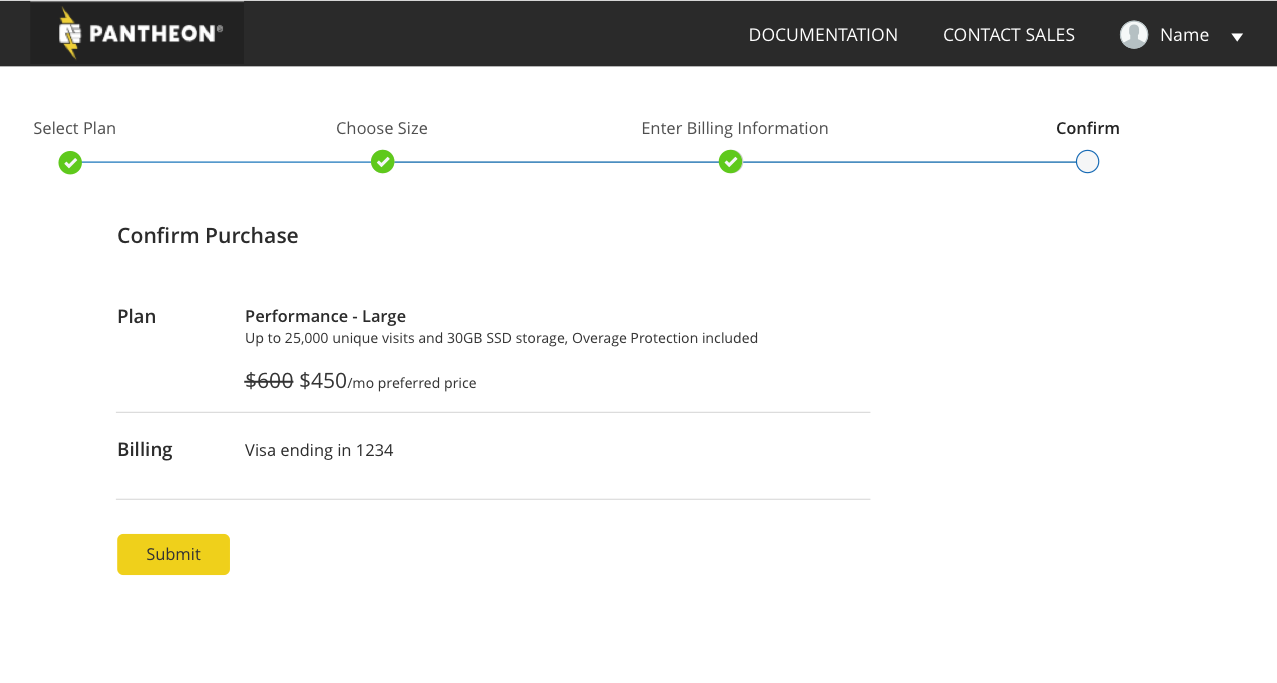
We also adjusted the checkout experience so that the customer firsts select the plan, then enters their billing information, and added a screen to confirm your purchase. This follows e-commerce patterns that users expect, so that friction during the purchase process is decreased.

To make it more obvious how to purchase a plan, we added a prominent "Upgrade" button. During a re-test, all 10 testers easily understood how to buy a plan.
No comments.