
Case Study | New Plans and Purchasing Experience
To support Pantheon's updated pricing and packaging for the first time in company history, we updated the product to proactively communicate the value of the platform while minimizing the perception of commodity web hosting, redesigned the entire checkout flow to align with an expected e-commerce experience, and implemented a new annual billing option.
Throughout the development, we conducted extensive user testing to ensure we sell the benefits the customer will receive (not features), highlight our main value prop, and call out differentiators we learned users care most about. These product improvements contributed to the company's accelerated revenue growth YOY.
Baseline User Testing
To learn how well the current purchasing experience performed, we started by performing baseline user testing by asking our testers to purchase a site.
Following are the main themes we learned.
Users don't know how to buy a site
When a potential customer is ready to launch their site and needs to purchase a plan, they will find no obvious way to do this from their site dashboard.
In one user test, all 5 testers had difficulty finding how to buy a plan, with 1 tester giving up (it can be found under the "Settings" area in the upper right).

There are multiple moments of friction
For example, once users found the purchase option in Settings, they were blocked from even being able to see the offers available by this modal asking them to first add a credit card.
This is an unexpected ordering for customers used to making purchases online, wherein they select the items they want to buy first and then give their billing information.

The offers are unclear
Once users add their billing information and return to this screen, they can review the offers. But they would find a minimal presentation of the site plans available, that don't communicate the value Pantheon can bring them. All of our testers were unsure which plan was the best choice given a set of site requirements.

Redesign Objectives
Based on what we learned from the baseline user testing, we created a set of objectives to improve the user experience and meet revenue goals
1 / Improve value communication to help the customers choose a plan best suited to their website needs
2 / Create a more obvious way to buy the site and a checkout experience more aligned with expected e-commerce experiences
3 / Minimize pre-existing perceptions that the customer is buying commodity web hosting by highlighting Pantheon differentiators
Design & Prototyping
By then, the new set of updated plans and prices had been drafted by the product and business executives. We launched into several rounds of designing and prototype testing this new set of plans to determine how we can best present them in order to most effectively communicate the value, based on our objectives above. I led the design and worked with a cross-functional squad throughout the development and implementation.
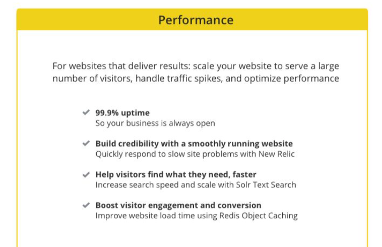
We paid special attention on the copy to highlight differentiators previously identified by our customers, and emphasized what the customer will be able to do once they've bought the plan.
For example. a customer buying a Performance plan for a site integral to their revenue stream cares about uptime, conversions, and being able to handle traffic spikes, but they don't necessarily care about the feature used to achieve that outcome. So we emphasized the benefit, ie. "Book visitor engagement and conversion", and minimized the method.
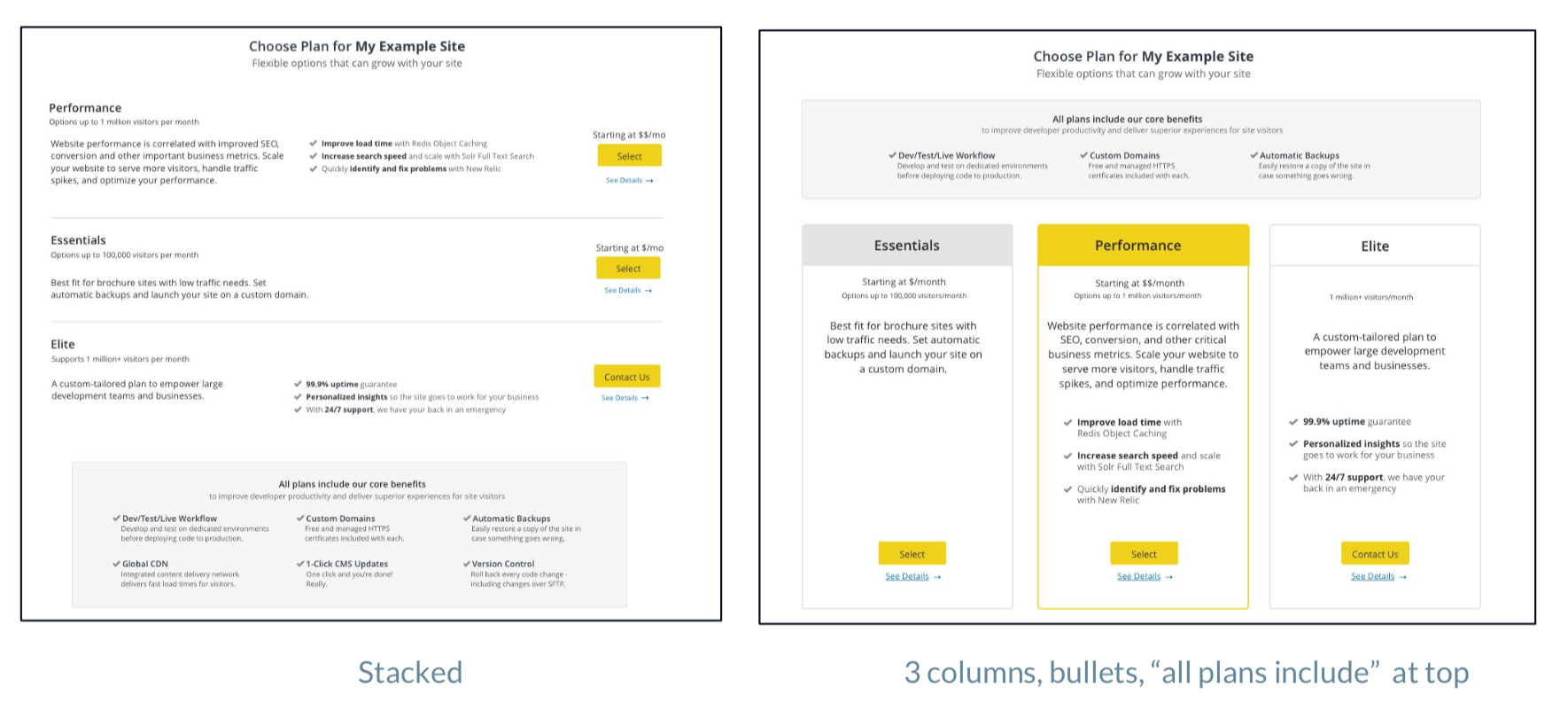
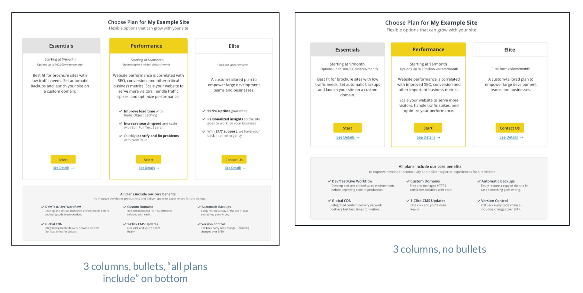
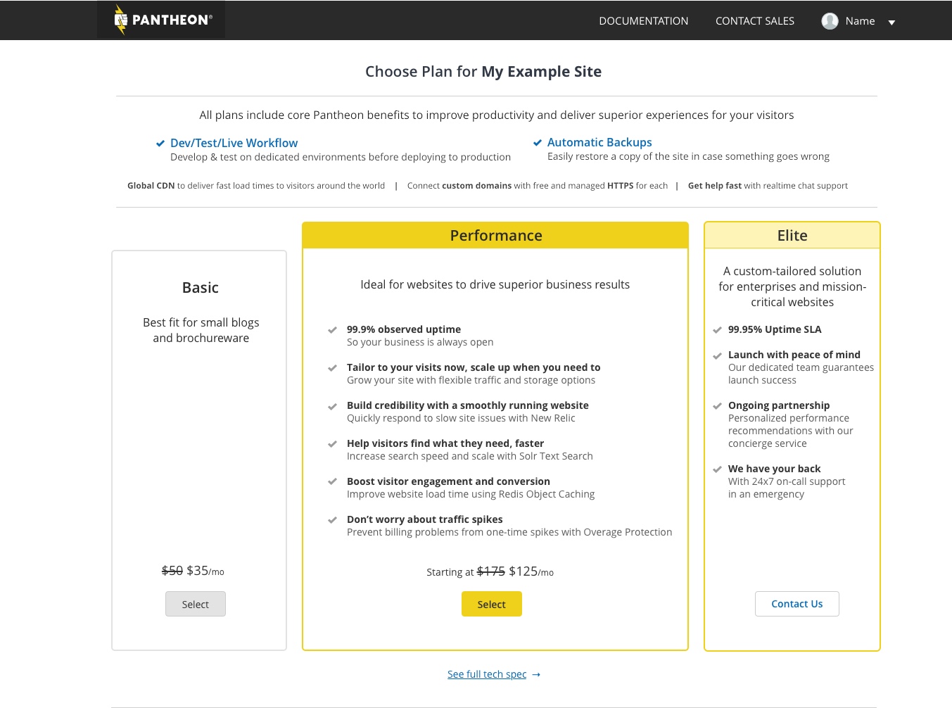
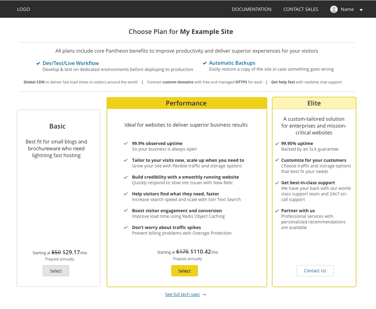
An iteration of the new plan selection screen (cropped)
Several layouts, orders, and various information densities on the plan descriptions were tested to learn which variation was most understandable and easiest to review.
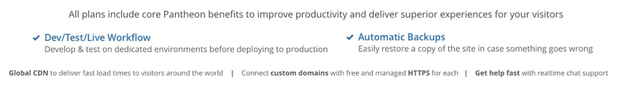
I added a new "All Plans Include" section to highlight benefits received no matter which plan is selected, which previously wasn't advertised here.
Minimizing Commodity
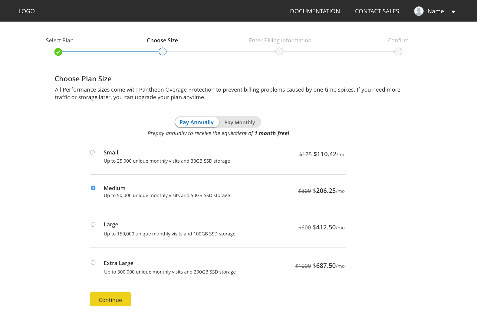
The Performance plan, as our main value prop, is available in many size specifications to support nearly every site. Size refers to the amount of traffic and storage a site needs. Since many services offer pageviews and storage for cheap, we had to find a way to minimize pre-existing notions of commodity hosting. We host the site, but also offer benefits and tools that other solutions do not so that development productivity increases and the site performs better for our customers' end users.
When purchasing a Performance plan, a customer selects the plan and then selects the size specifications they want.
I tested variations of how much information to display about the Performance size options on the main plan to learn how that affected testers' perception of the offers.
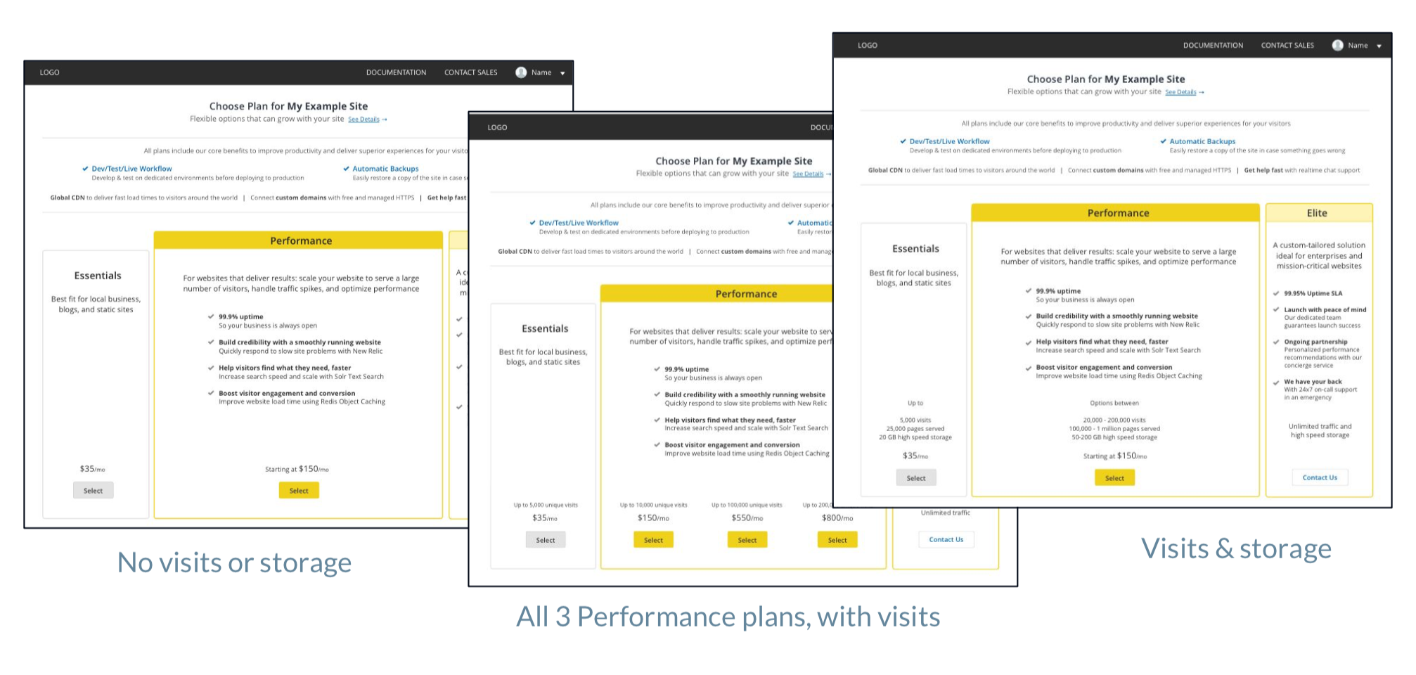
And I tested several options for the user flow. Should customers select the Performance plan size fom the beginning, or later on in the flow once they've made their first decision on which plan to buy?
We hypothesized that customers would perceive higher value received when selecting the size later, which user testing confirmed.
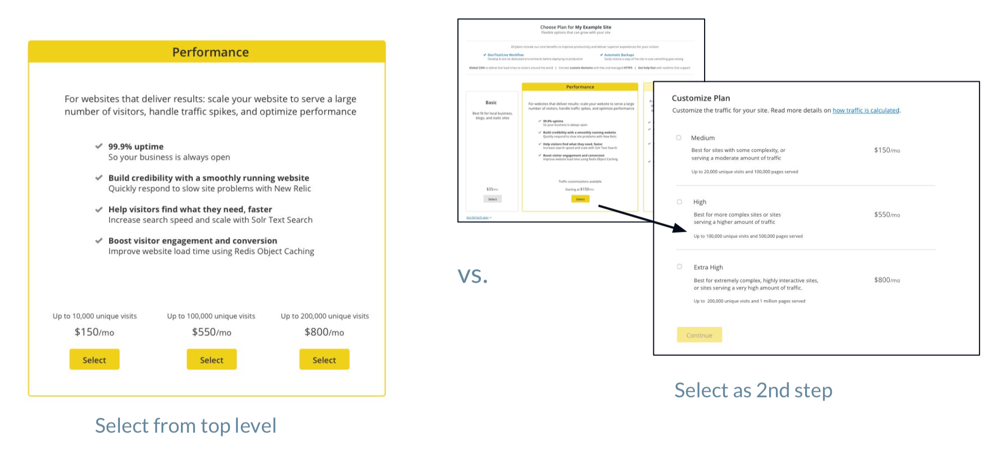
Prototype 1 includes size selection at the first step:
Prototype 2 places size selection at a later step:
Too much emphasis on technical specifications lowers the perceived value
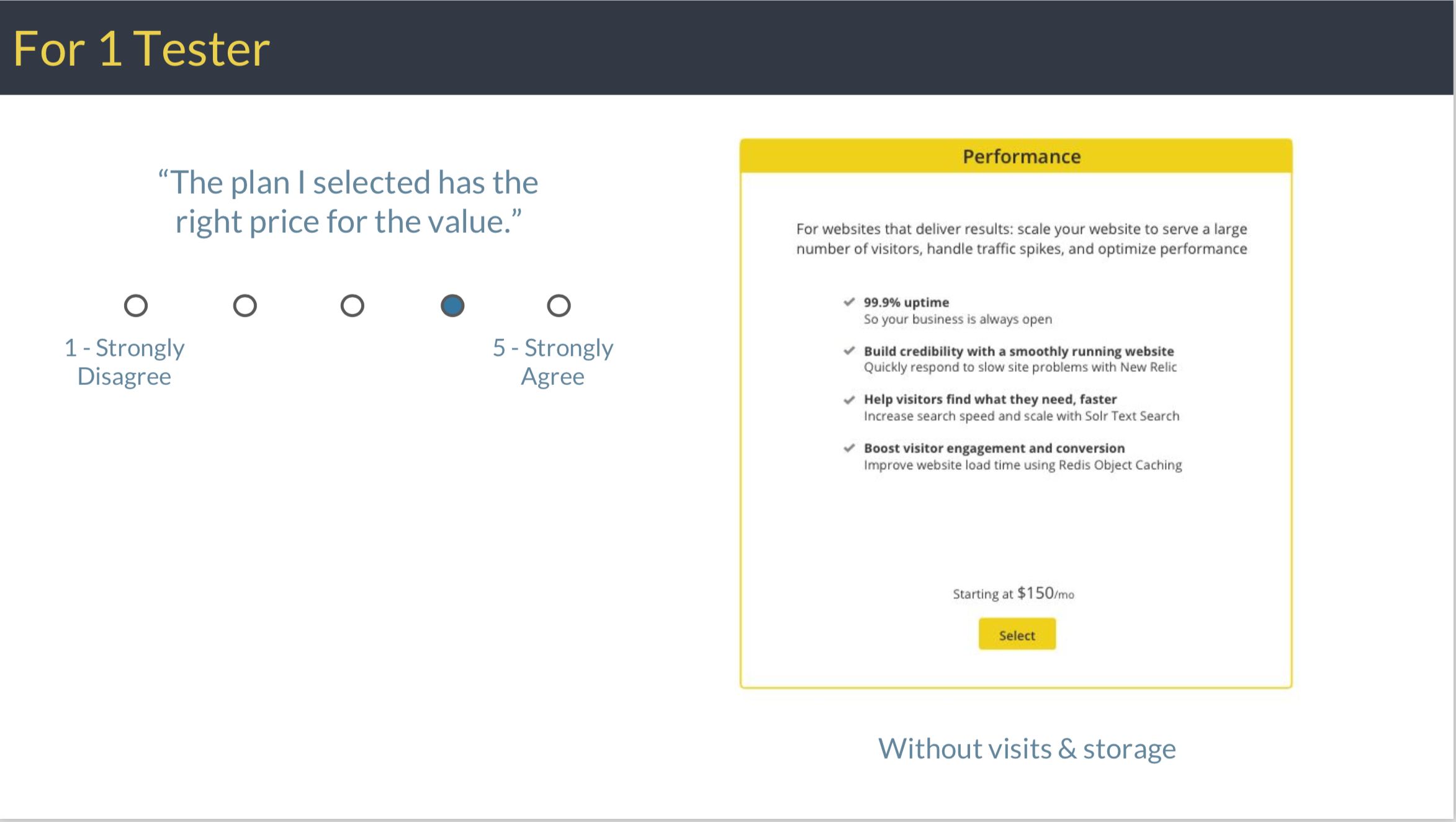
For this user test, I gave testers an example site and its requirements, and asked them to buy the plan they would choose for that site. After they bought the plan, I asked them to rate the value they received for the price.
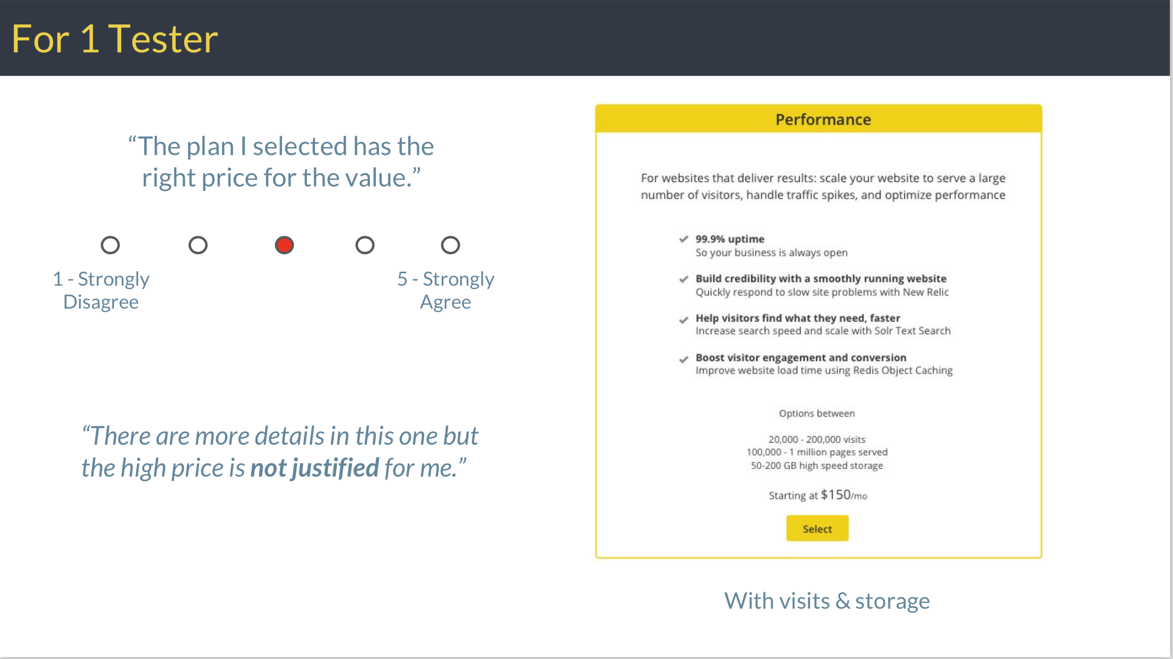
In this example, this tester rated the value a 4/5 when no specs were included on the main page.
The same tester, who chose the exact same plan in a later question, then reported receiving lower value (3/5) in the version displaying the specs, even though they selected the size at the next step.
For another tester, perceived value increased to 5/5 when a tester selected the size specifications later, compared to a 4/5 rating when size was selected first.
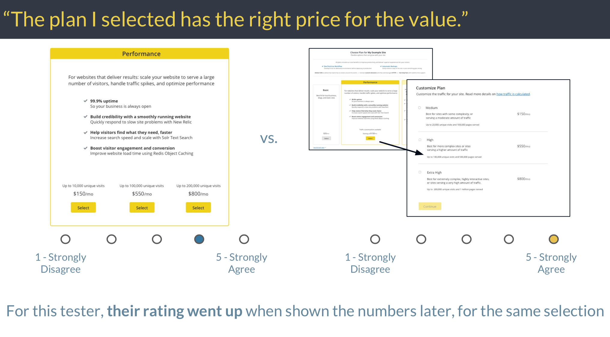
We concluded that showing specifications testers associated with a commodity good distracted from our main value prop. We decided to save the size specification choice for later in the user flow, and focus on use cases and benefits on the main page. This approach encourages testers to first consider their goals for the site (such as how important it is to their business), reduces distraction, and focus on benefits received, all of which resulted in testers ultimately feeling more confident about their choice, when asked at the end.
New Purchasing Product Experience
The user test conclusions led into a final design pass and product implementation of a new purchasing experience.
Make it obvious how to buy a site
We added a prominent "Upgrade" button to unpaid site dashboards. During re-testing, 100% of testers easily knew how to buy a plan, compared with 100% of testers having difficulty before.

A dedicated plan selection experience
The Upgrade button launches a new full screen experience, rather than using the small Settings overlay on top of the dashboard as before. The plans page now presents the offers without the obstructive popup asking users to enter their credit card information, communicates what customers receive in a way that is relatable to their needs, reflects the website goals, and helps them choose the best option for their site.
A new section at the top of the plan selection page communicates benefits customers will receive, no matter which plan they choose. Here, we highlighted what customers consider to be our most compelling differentiators, but also included features that customers considered to be tablestakes (such as free HTTPS) in order to reduce doubt about what is included in their purchase.
Specs take a backseat
If the Performance plan is chosen on the first step, the customer selects the size they need on the next step. This positions pageviews and storage numbers as more of an afterthought, and reduces the perception of buying a commodity.

Checkout flow aligns expectated patterns
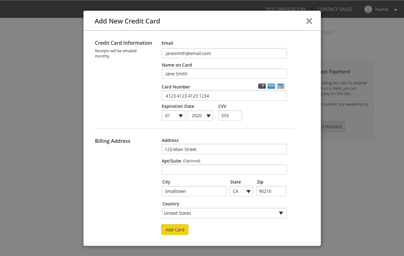
We redesigned the remaining checkout steps to now ask for the customer's billing information later in the process, rather than as the first step.
This ordering aligns with e-commerce patterns users expect, in order to reduce friction during the purchasing experience.
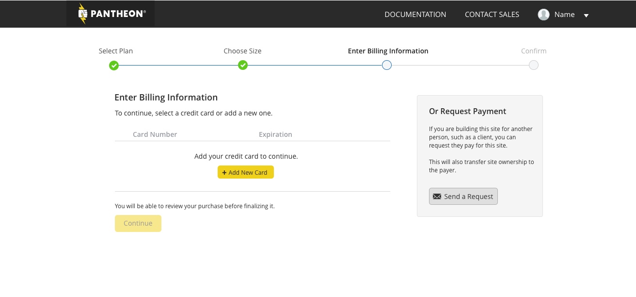
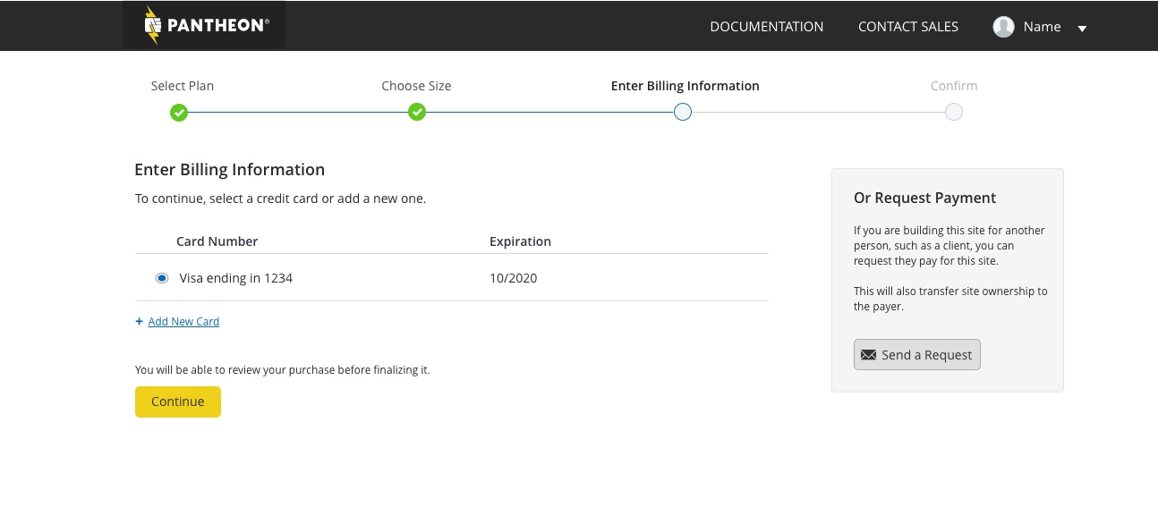
Finally, we added a confirmation step so that customers have the opportunity to review their selections before they commit.
This helped testers feels more confident throughout the experience even from the very beginning, because they saw they would have a chance to review their order from the wizard step bar above.
Annual Billing
After the new plans launched, we integrated a new annual billing option with an incentive of up to 2 months free in order to capture a year's worth of revenue immediately, and reduce risk of churn as we moved existing customers over to the new plans by providing a lower price.
In the revised plan selection screen, we led with the annual plan option (see the strikethrough price and the discount), since most of our customers buy websites that will stay up for years, and it's the best deal for the customer since they can get up to 2 months free.
I ran multiple rounds of user testing to ensure it is straightforward for customers to buy an annual plan, and to make sure customers understood they had a new annual or monthly option to choose from (in Pantheon's prior 7 year history, there was no previous annual plan option for self-service checkout). I also made sure I did not inadvertently introduce usability problems into the existing experience.
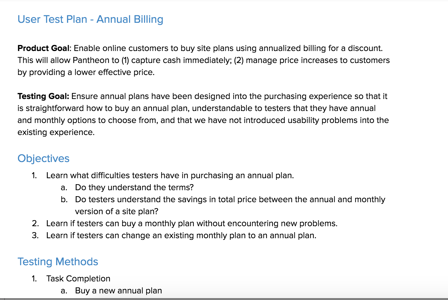
Test plan excerpt
Customers could choose between an annual or month-to-month plan, so I iterated and tested several versions of a toggle to ensure it is noticeable.
In the earlier iterations, many testers overlooked the toggle and didn't notice they had bought an annual plan (don't worry, it was a fake purchase).
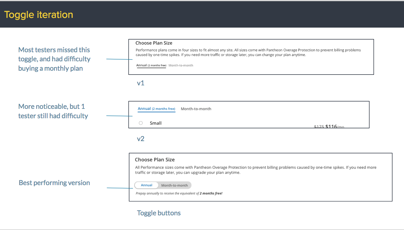
This near-final version places centers the toggle and increases the size, which was the most noticeable to all our testers.
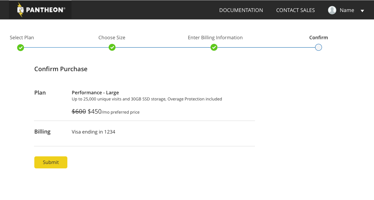
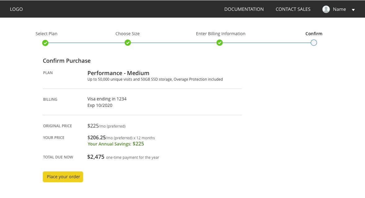
I also redesigned and tested the confirmation step to display the annual savings to the customer.
In this first try, the savings was completely unclear to testers and it forced them to do the math if they wanted to know exactly how many dollars they were saving.
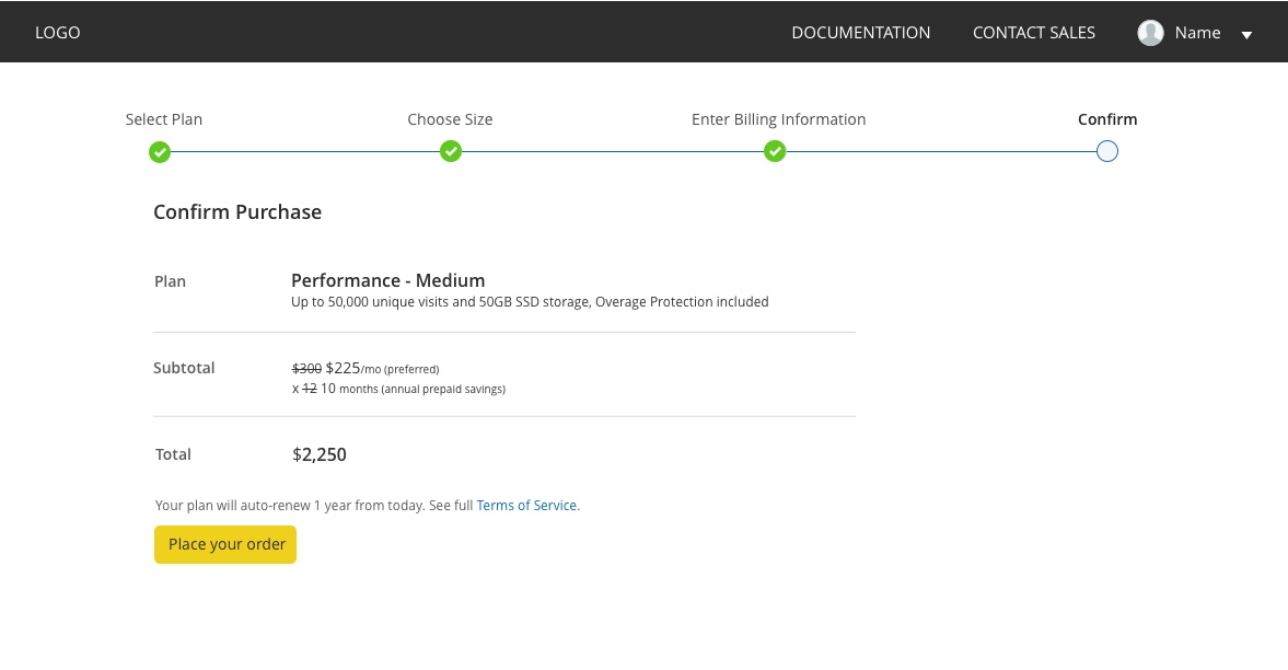
This iteration does the math for them so the dollars saved was more obvious, but testers were confused at what their actual cost per month was because there was too much information packed into the subtotal line.
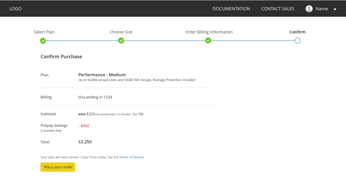
This led to the most successful understanding of how the savings is calculated due to the framing of an "original" price vs. "your price".
Impact
Pantheon released the new plans on schedule in April 2018, followed shortly by the annual billing option. We launched with confidence due to our investment in identifying ways to improve our value communication, testing design iterations to proactively sell the benefits and differentiators our customers care most about, and minimizing the pre-existing perception of commodity web hosting through the plans presentation and purchasing experience.
© Kim Kiser Ramirez 2020