The Inventory system is a critical part of the product that customers use to upload counts (manual or through our barcode scanner) of their inventory on a regular basis, and track their items over time. Through usability testing of the existing system and review of common support tickets, we learned the existing 7-step process was long, overly complicated, doesn't provide guidance, and doesn't help users catch errors.
We redesigned this into a 3-step process which guides the user, provides additional help options, and proactively helps the user catch errors earlier. Once released, the improvements reduced user frustration, the amount of time spent on this task, and the number of support tickets received.
Some positive feedback we've received in testing this new inventory include:
- "Much cleaner, faster, and takes out unnecessary things you had to do and look at before"
- "It worked really well. It was very intuitive and simple."
- "The visual design seems very clean."
- "The variance report is very clear, much better than the old one, and it will be understandable to a newer person."
Existing System
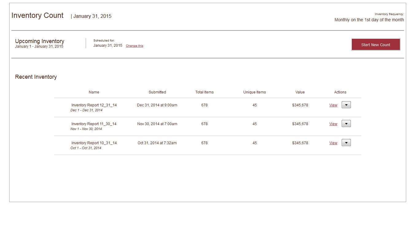
Most restaurants count inventory once per month, by manually counting items in a spreadsheet or using our optional barcode scanner. The items are uploaded into the product through the Inventory system. Through usability testing of the existing system and review of common support tickets, we learned the existing 7-step process was long, overly complicated, doesn't provide guidance, and doesn't help users catch errors.
The existing process:

This is meant be a linear process, but instead the UI allows users to jump in at any point, and potentially the user can cause destructive action on their inventory.
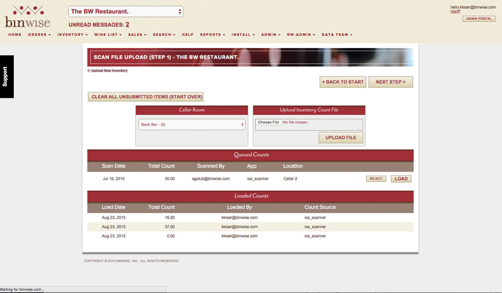
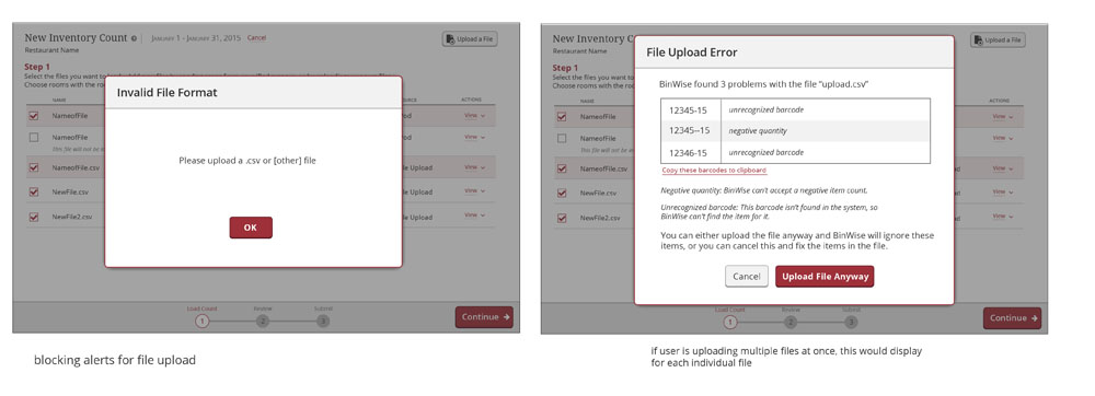
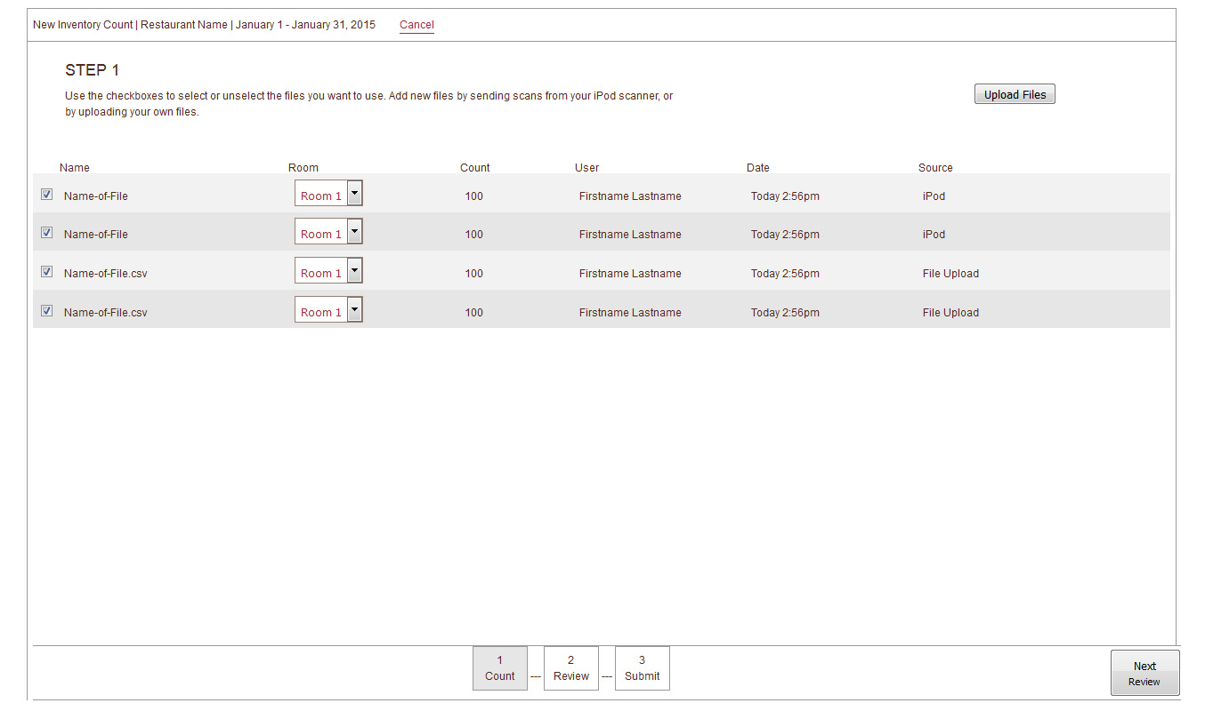
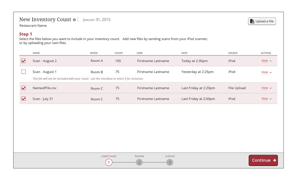
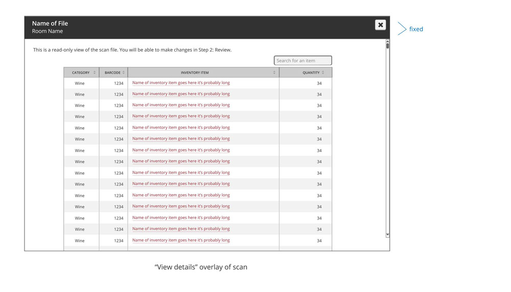
Scans are uploaded from a barcode scanner or a spreadsheet. Even though most users do one or the other, they are presented with both options which is unnecessary. Users also can't review the contents of the scan to verify they are uploading the scans they intended.

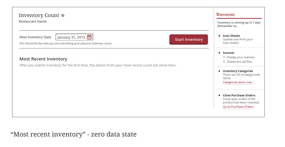
Users select the day of their inventory count. The problem is this field is not required, there is no default set, and the instructions are a mess. Users often click 'next step' without picking a date. By the end this causes their inventory to NOT be submitted, even though they think it has and the product does not say otherwise.
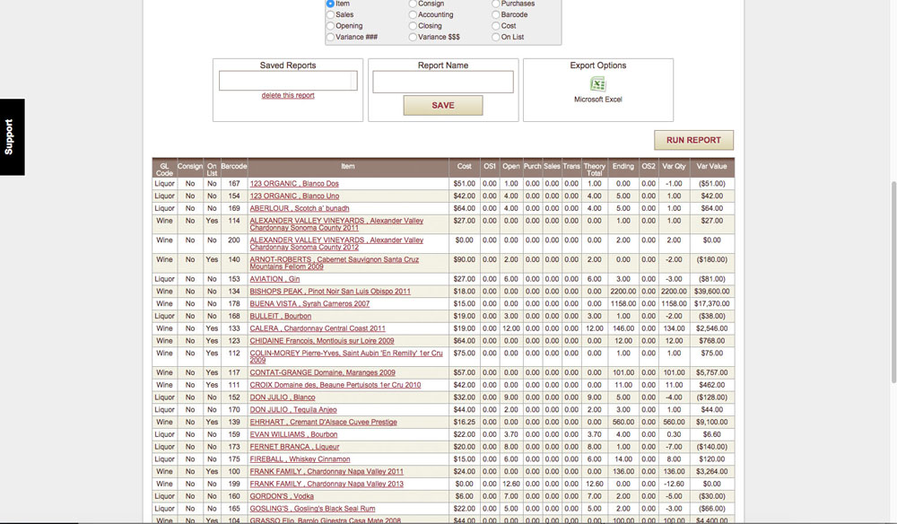
This data is poorly presented - it's difficult to figure out what's important, and it's overwhelming for new users.

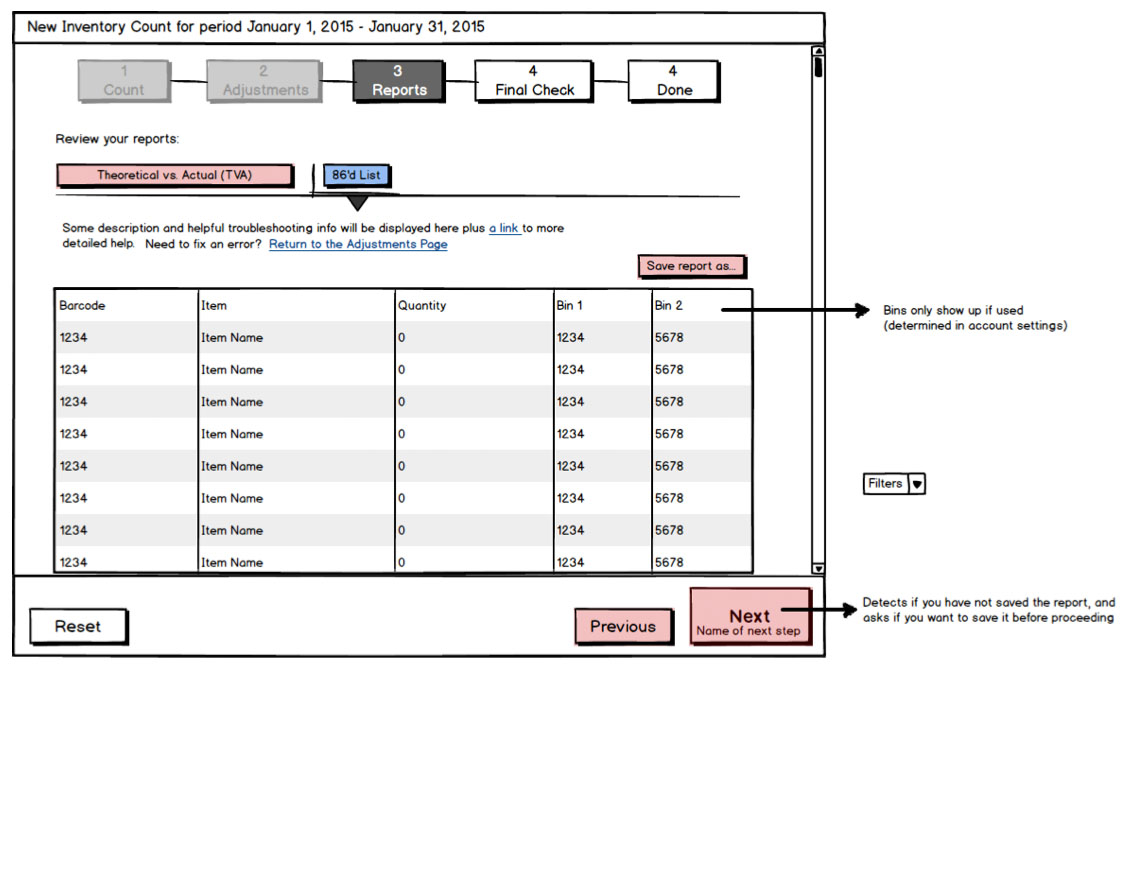
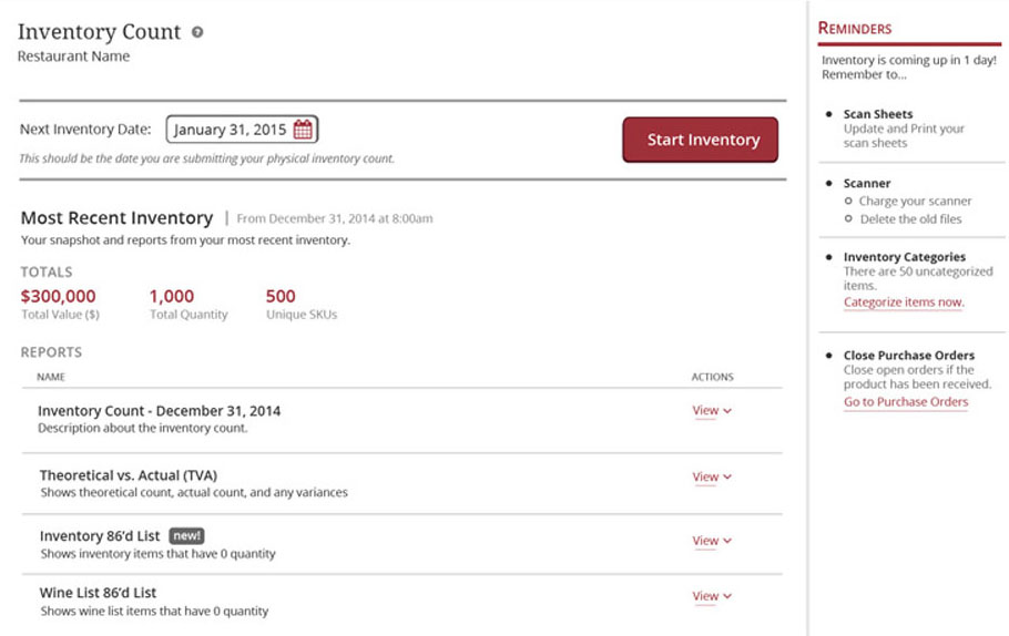
The variance report compares their actual item count with the count the system thinks they have. This helps the users pinpoint loss from shrinkage and overpouring. It's one of the product's most valuable reports, but due to the "Run Report" button being difficult to find not a lot of people use it.

This step is identical to one of the previous ones, which is confusing for users.

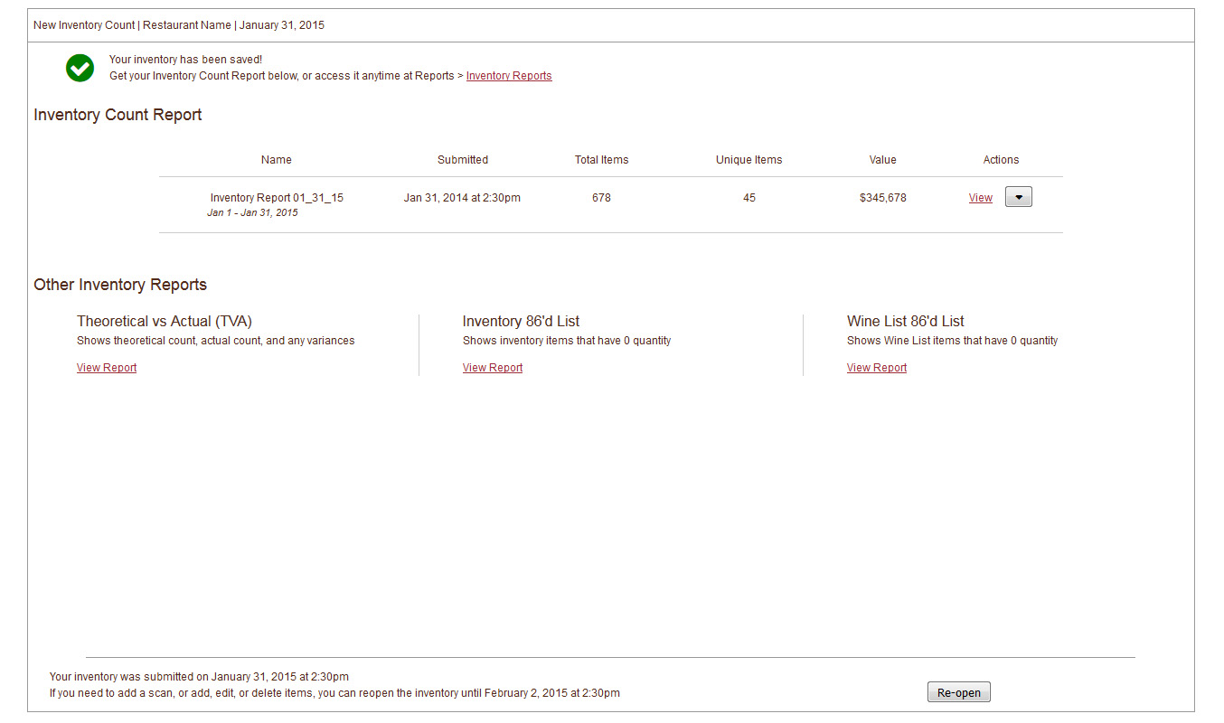
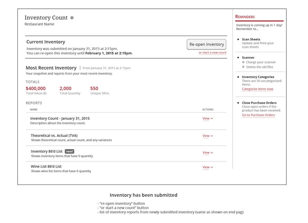
Once users are done, there is no confirmation or much reassurance that their count was closed. Sometimes there is an error behind the scenes that never surfaces in this UI, so users don't know if something went wrong.
Key Points
- Long and complicated process
- Inventory typically happens late at night after a restaurant has closed (I've talked to people who have to stay until 2 or 3am), or very early in the morning. No one looks forward to counting inventory. Then when they come to the product, they are presented with this overly complicated and confusing process. This can cause frustration at a time where they are already stressed out and almost at the finish line.
- No Guidance
- Since inventory counting is an infrequent task (usually once per month) and the system leaves a lot for users to figure out on their own, they forget how to do it each month which causes stress for them and a high volume of support tickets for us.
- Unhelpful Errors (or none at all)
- The system does not always present errors if something goes wrong; or if it does, they are generic and unhelpful. The system does not also help them sort out obvious mistakes with their counts.
Redesign Goals
- Streamline the process
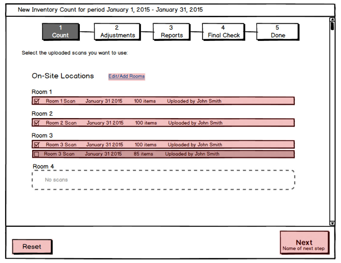
- The old system took 7 steps. Through internal and user testing we reduced this process down to 5 steps and then finally 3 steps.
- Provide guidance
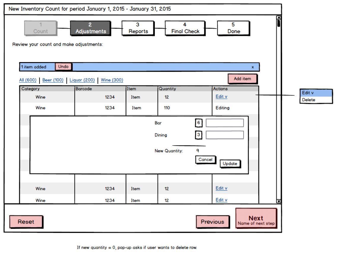
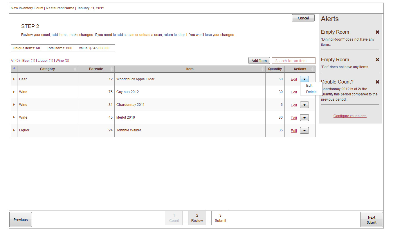
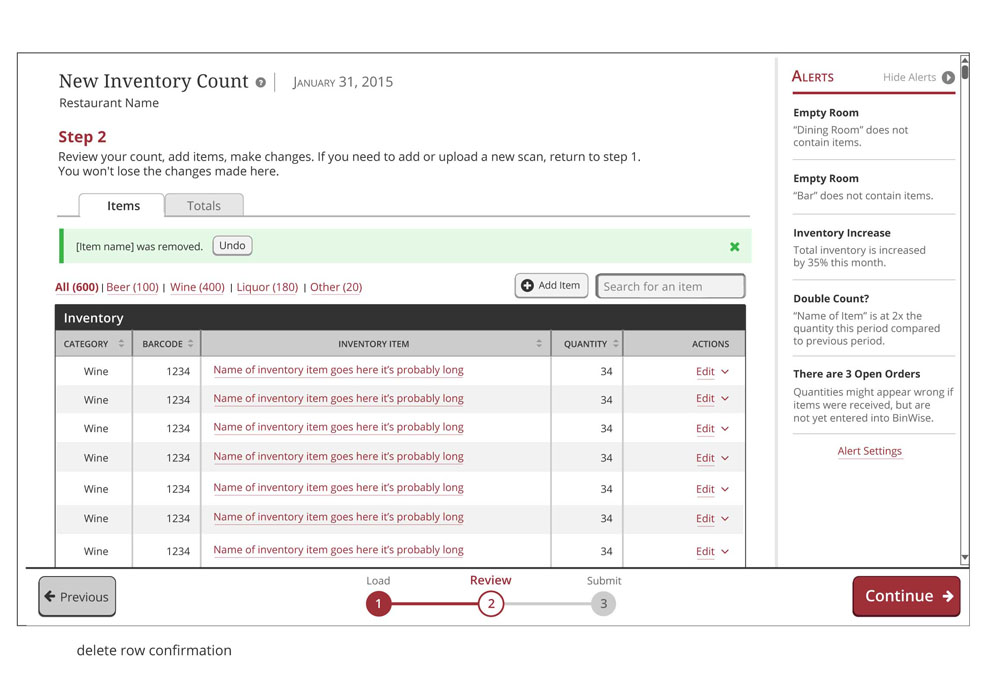
- Provide clear instructions, guide the user, provide more context with where they are in the process and what they will do next. The new design has instructions on every step and a progress bar reinforces the current step, steps they have completed, and steps that are remaining.
- Proactively provide help
- The redesign helps users catch errors. For example, sometimes an item count will show a negative number - it's impossible to have a negative number of an item so that usually means a sale was captured wrong or a piece of data was entered wrong somewhere along the way. The system knows things like this, and we want to utilize this better to help users catch errors earlier. Now, all errors tell the user what went wrong and what actions they can take to fix it. When it's midnight and all the user wants to do is complete their inventory count this will help enable them to do that instead of opening a support ticket and waiting for a response the next day.
This is a walkthrough of the redesigned system. (Set to HD for crisper text).
Design and development
Interactive mockups
- User flow - early
One of the very early user flow mockups. - User flow - revised
Revised user flow example after some testing
I worked with the front-end developer to create an in-browser prototype as we got closer to the final user flow:
Through testing these prototypes we learned a lot, such as...
- We learned more users than we thought don't use our barcode scanner, but instead count item manually and keep them in a spreadsheet. We then prioritized support for a manual file import higher than we originally thought.
- Some terminology we were using was confusing to our audience. For example, we changed "export" to "download".
- Users expected some new features we were planning, such as the "Alerts" sidebar and the ability to verify contents of a file, would help them catch errors quickly
- One major pain point we learned during this testing was the existing system had no way to search for a specific item! We completely overlooked this in the beginning. In the existing system the items were alphabetized and the UI was paginated by letter. So if I wanted to check an item that started with the letter M, I had to click on that letter, then navigate through all the pages of items that started with M in order to find my item. In the redesign, we added a search bar where they can search by item name and other parameters (such as the price, the barcode number, the quantity...).
Detailed design
The visual design and detailed interaction design was developed concurrently with our new pattern library.
Design comps:

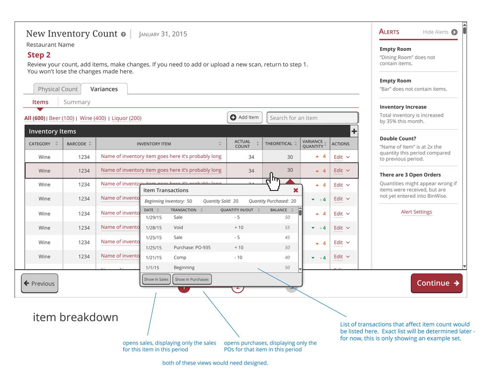
An idea for an informational drill down - to show detailed buying and selling transactions - that wasn't used
Old report example:
Report redesign:
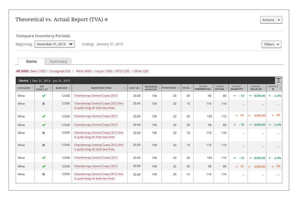
We gave space around the text, used icons where possible to make it easier to take in information at a glance, used directional arrows and color to make the high variances and low variances obvious, and removed unused columns to reduce clutter.
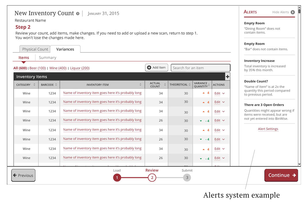

Each restaurant is different, so these alerts are customizable depending on what individual restaurants and users need.
No comments.