To design an interface, first we have to get to the root of the problem it's trying to solve. What is the goal for this particular interface, and how do we measure it? Your goals might look like some of these:
- "How do we design for mobile to reflect the essence of our existing brand, while making it as usable as possible for our customers?"
- "How can we design these games so that they are fun for preschoolers?"
- "What can we do to increase our email list sign-ups?"
- "How in the world do I organize the insane amount of information here?" (Answer: I will tell you there's no way you need all of that information there.)
You might not even know your goal. That's cool. Part of a designer's job is to work with you to figure it out. This will involve much research, planning, and deep, insightful questions that go beyond the scope of this post. Once we do have an idea of what this interface needs to accomplish, forget every beautiful piece of UI you have pictured in your mind. It is really tempting to open Photoshop right now and immediately start on the visual design - I understand, but do not do this. It will only lead to pain later. And close that Dribbble inspiration tab you just opened. You don't need the distraction right now.
It's time instead for one of my favorite parts of the design process - wireframing!
Wireframes are composed of rough sketches and basic shapes, can be standalone, or storyboards, or even click-through mockups to help evaluate how the interface flows from one screen to the next.
"Feel the Music" wireframe for Daniel Tiger's Neighborhood website
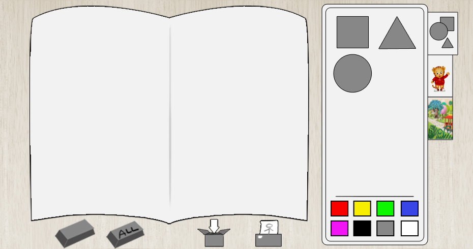
"Make a Card" wireframe for Daniel Tiger's Neighborhood website
Early storyboard for Inklings
Here we focus on functionality, content hierarchy and priorities, screen layout, navigation systems, and how all of those components (and more! Or less.) work together. Wireframes can seem unglamorous on the surface, but I actually love this stage because this is where we can dig down deep to figure out exactly what this interface wants to be. This is the time of the project where I have the most freedom to experiment with whatever pops into my head. Even the ones I think are a little too crazy I hold on to because it (or a piece of it) might come in handy later. Focusing on the core layout and functionality needed before starting with visual look and feel will save just a ton of time and energy.
Whatever methods I go with, I keep the elements sketchy, loose, and simple so that I can quickly explore a bunch of different ideas. Keeping this work sketchy and fluid will help us to throw away the ideas that aren't working without feeling like we are losing our precious dreams. This is a hugely iterative process and the majority of the work produced in this stage will be not right for the project or will be just plain bad. Throw it away and start again. It's totally fine.
At every step here, evaluate your design in the context of the goals established at the beginning of this process. Example questions to ask yourself:
- Is this interface efficient on the outside and in the inside? Will this be intuitive and delightful for my users? How will we smartly build this so that it runs well and is easy to modify down the road?
- Do all of these functions cover the project goals? What are we forgetting here? What is extraneous and can be taken out?
- Is this information arranged in a hierarchy that draws the user's eye to the most important pieces first?
- Did I remember the "submit" button at the bottom of the email form?
What follows will hopefully be a frank discussion of what parts miss the goals and why.
Let's take an example from the Daniel Tiger Neighborhood's companion website I worked on for Schell Games and the Fred Rogers Company.
This was the first wireframe of the site structure:
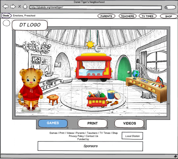
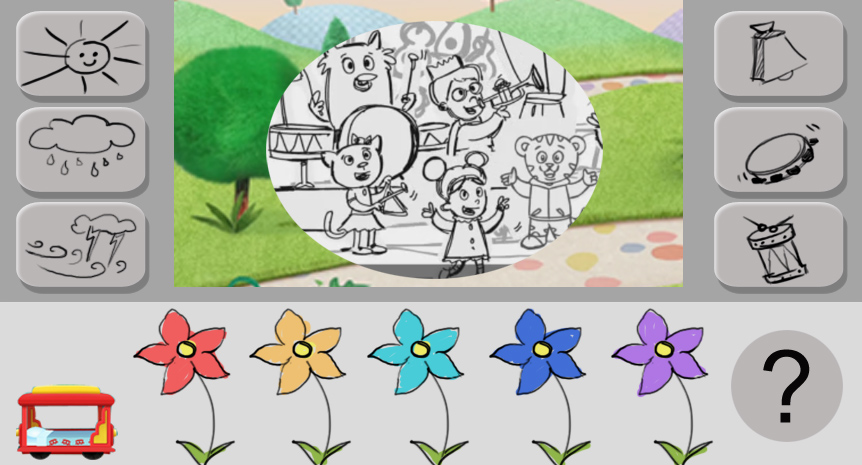
We felt pretty confident about the layout and this design for the games navigation page. The idea here was to have Daniel's bedroom serving as the gateway to the 6 games were were making. Kids would click on each of the appropriate objects to navigate to go to that game. For example, clicking the trolley in the foreground would take you to the Trolley Game, the desk to the right would take you to the Make a Card game, and the music instruments awould take you to the Music Game.
The team was excited about this idea, however through discussions we realized this misses a key project goal. We were creating this site and suite of games for a very young demographic - children between the ages of 2 and 5. When designing for kids, especially those who are so young, it's vital to have a clear and obvious navigational structure. This design didn't do a great job of making it obvious where to click. Plus, it would also have problems scaling if the client decided to add more games in the future (which they did!). We decided to lose this idea and go with a layout that is more straightforward:
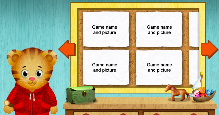
Here is the final art:

We were able to keep Daniel's presence here, and set it in Daniel's bedroom so it could still be connected to a recognizable setting from the show. On the site, he also plays through some character animations and greets the player, bringing life to the page.
This navigation worked great during testing - kids had no issue figuring out where to go. The very young ones would simply point to a picture that they liked, and then the parents would click on it, launch the game, and help them from there. Had we not closely evaluated the wireframe, we probably wouldn't have realized the problem until much later down the road, during or maybe even after the art development. If we had to go back to redo the layout after we thought the art was finished, that would have cost us so much time and frustration.
By openly discussing early what is wrong and why, that is how we will get to right by the end.
No comments.